Hot Keyword:
When embarking on the packaging design project for FreshGuard adult diapers aimed at the Uzbekistan market, our design team initiated a comprehensive research phase. We delved into the local cultural nuances, consumer preferences, and market trends in Uzbekistan. Understanding that the packaging needed to resonate with the local population, we explored elements that would convey both functionality and cultural relevance.


We noted the significance of natural imagery and traditional motifs in Uzbek aesthetics. This led us to brainstorm concepts that combined modern design with local sensibilities. The name "FreshGuard" was a cornerstone, and we aimed to create a visual identity that would reinforce its meaning of freshness and reliable protection.
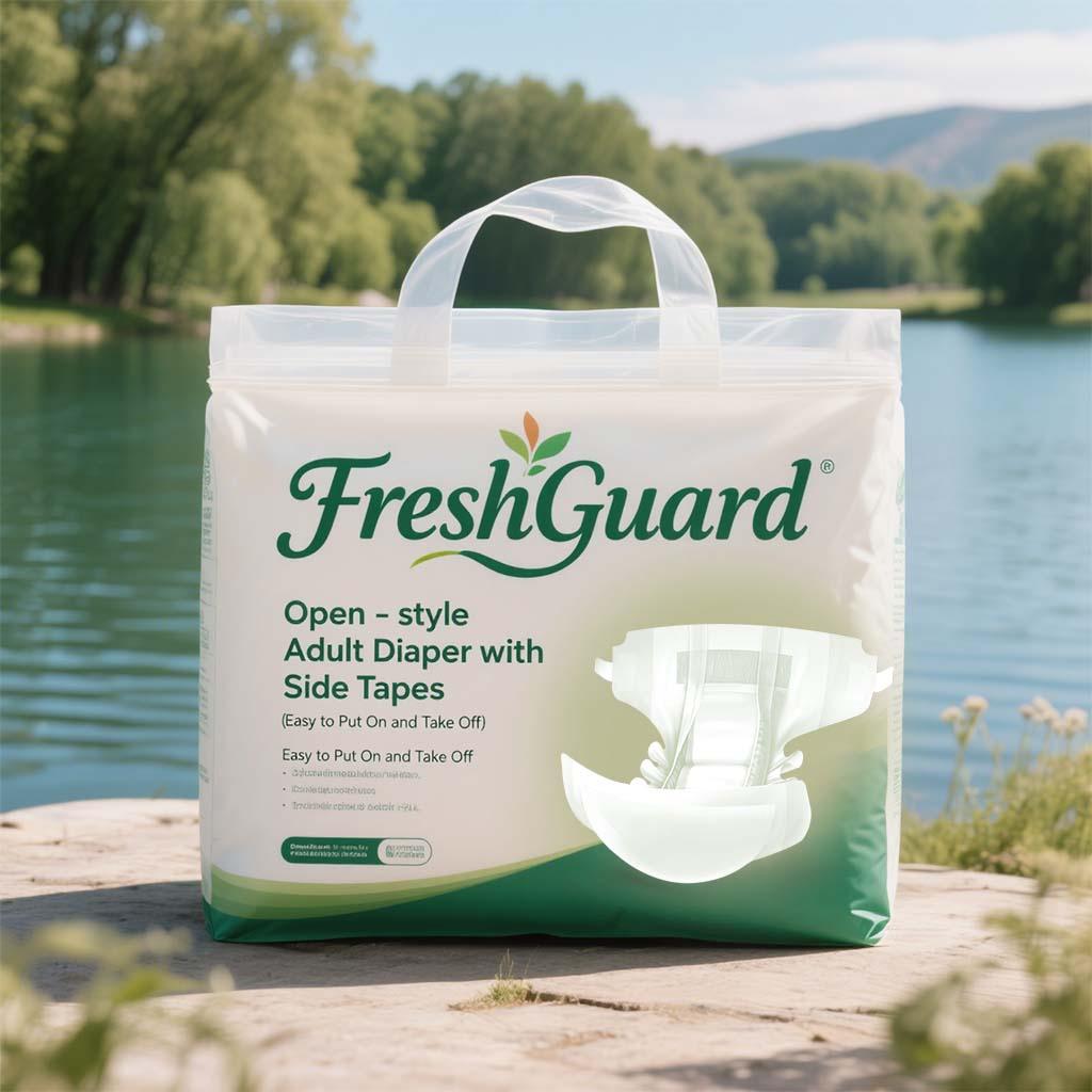
Based on our research, we developed two initial design prototypes. The first design featured a clean and fresh color scheme with green gradients, evoking a sense of nature and hygiene. It prominently displayed the product name "FreshGuard" in an elegant font, along with key product features such as "Open - style Adult Diaper with Side Tapes (Easy to Put On and Take Off)". The imagery of the diaper was clear and straightforward, set against a backdrop of a serene lakeside scene, aiming to project a calm and reassuring atmosphere.


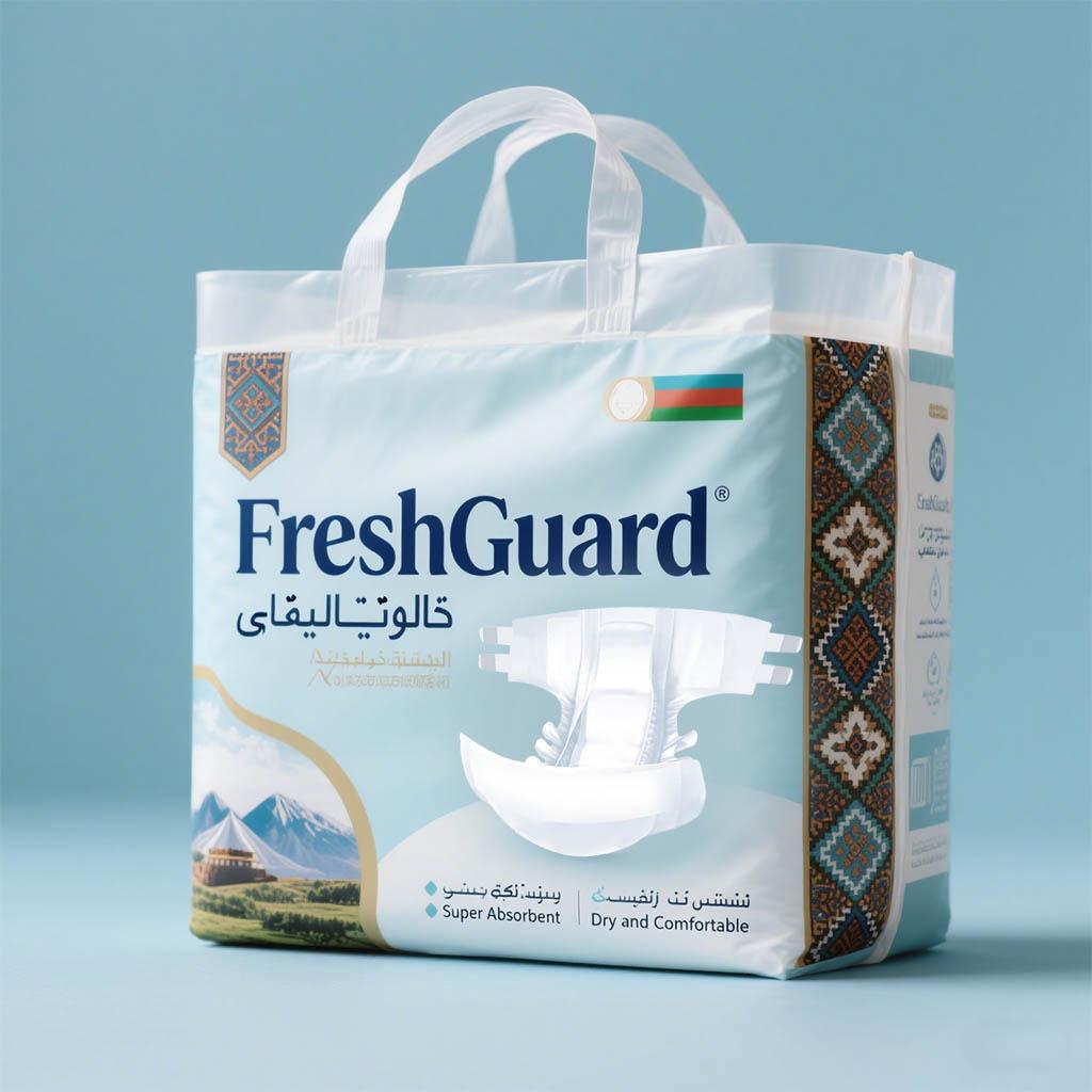
The second design took a different approach. It incorporated traditional Uzbek patterns along the sides, which added a cultural touch. The color palette was softer with light blue tones, and it also included the national flag of Uzbekistan subtly, signifying a sense of local pride. The product name "FreshGuard" was displayed in bold, accompanied by translations in the local language, and key benefits like "Super Absorbent" and "Dry and Comfortable" were highlighted.
They felt that the integration of traditional Uzbek patterns and the inclusion of the national flag made it more culturally resonant. The local language translations and the emphasis on key product benefits in a more visually appealing manner also aligned better with their marketing strategy. They believed that this design would have a stronger connection with the local consumers, making it more likely to stand out on the shelves.
 Tel: +86-18359551931
 Email: nicole@qw1931.com
 MP/WhatsApp: +86-18359551931
 Manufacturer Address:No.179,Tangsu Industrial Park,Tangshi Community,Xintang Street,Quanzhou City,Fujian Province CHINA