Hot Keyword:
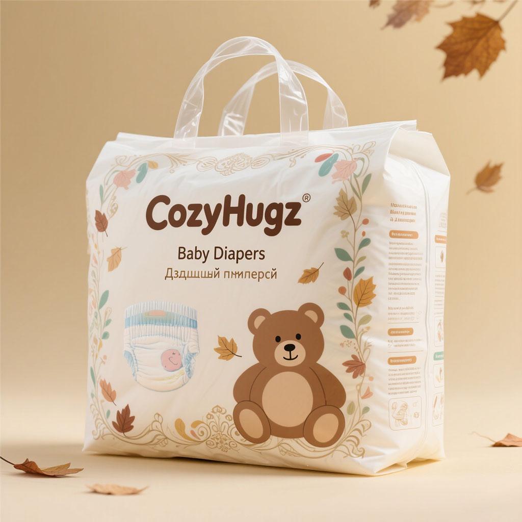
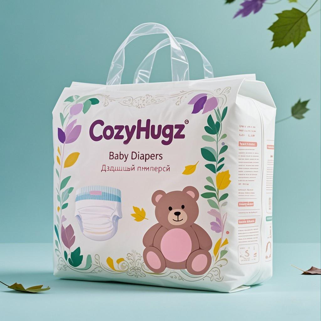
A client from Belarus approached our company with the brand name "CozyHugz" and the task of designing packaging for their baby diapers. Our initial design concept aimed to create a cute and appealing look for the product. The first - draft designs, as shown in the first and second attached pictures, featured a charming aesthetic. They included a teddy bear graphic, surrounded by delicate floral and leaf motifs. The color schemes were soft and pastel - based, with one design set against a light blue background and the other against a beige one. The brand name "CozyHugz" was prominently displayed in a stylish font, along with the words "Baby Diapers" and some text in Belarusian. When the client first saw these designs, they were pleasantly surprised and expressed initial admiration for the cute and endearing style.


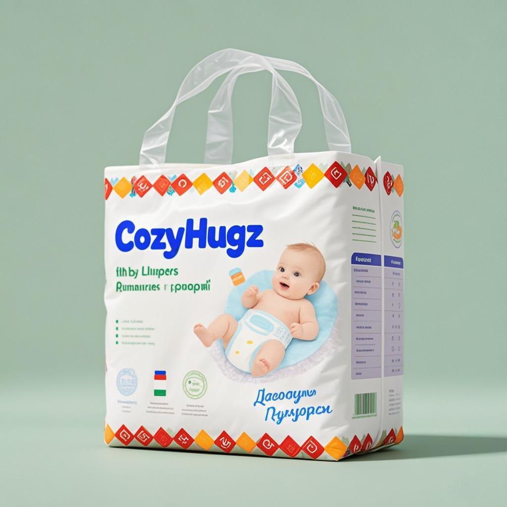
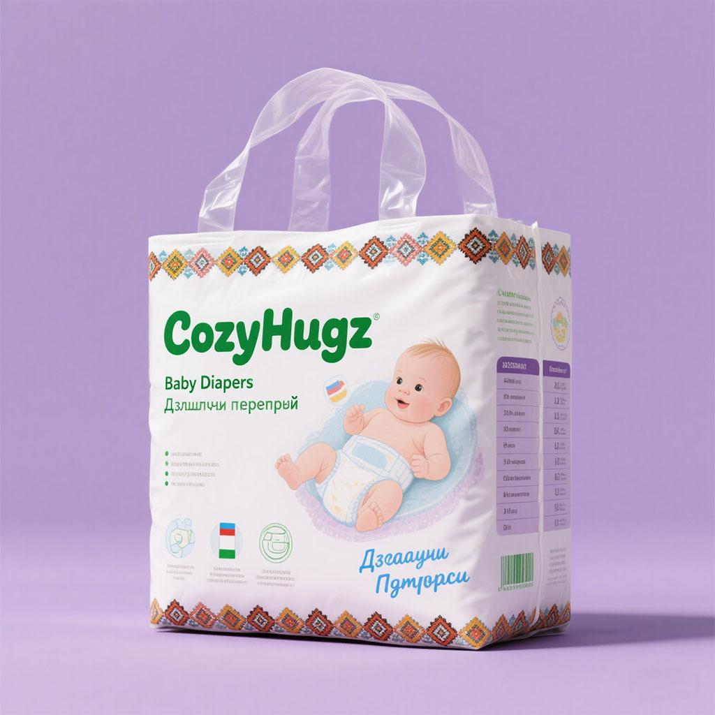
However, during the client's internal decision - making meeting, they had a change of heart. They felt that the initial cute - style designs did not align with the overall corporate style of their company. They wanted a design that was more modern and less focused on cuteness. In response to this feedback, our design team immediately got to work on a new approach. We shifted our design style to a more contemporary and clean - cut look. The third attached picture represents the new design direction. This design features a baby lying on a soft surface, wearing the diaper. The color scheme is more vibrant with a combination of white and bold, contrasting colors for the brand name and decorative elements. The layout is more straightforward, emphasizing functionality and modernity. The client reviewed this new design and confirmed it as the final direction for the packaging.


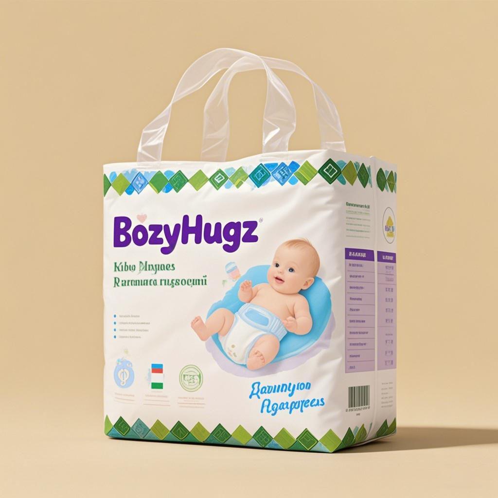
Since the client required packaging for three different diaper sizes, we decided to create a series of designs that would be visually cohesive yet distinguishable by color. We designed two additional versions, as shown in the fourth and fifth attached pictures. These designs maintained the core elements of the approved third design, such as the baby graphic and the modern layout. However, we used different color combinations for the decorative patterns around the edges. This way, each size could be easily identified on the shelf while still being part of the same "CozyHugz" brand family.

 Tel: +86-18359551931
 Email: nicole@tansoxpack.com
 MP/WhatsApp: +86-18359551931
 Manufacturer Address:No.179,Tangsu Industrial Park,Tangshi Community,Xintang Street,Quanzhou City,Fujian Province CHINA