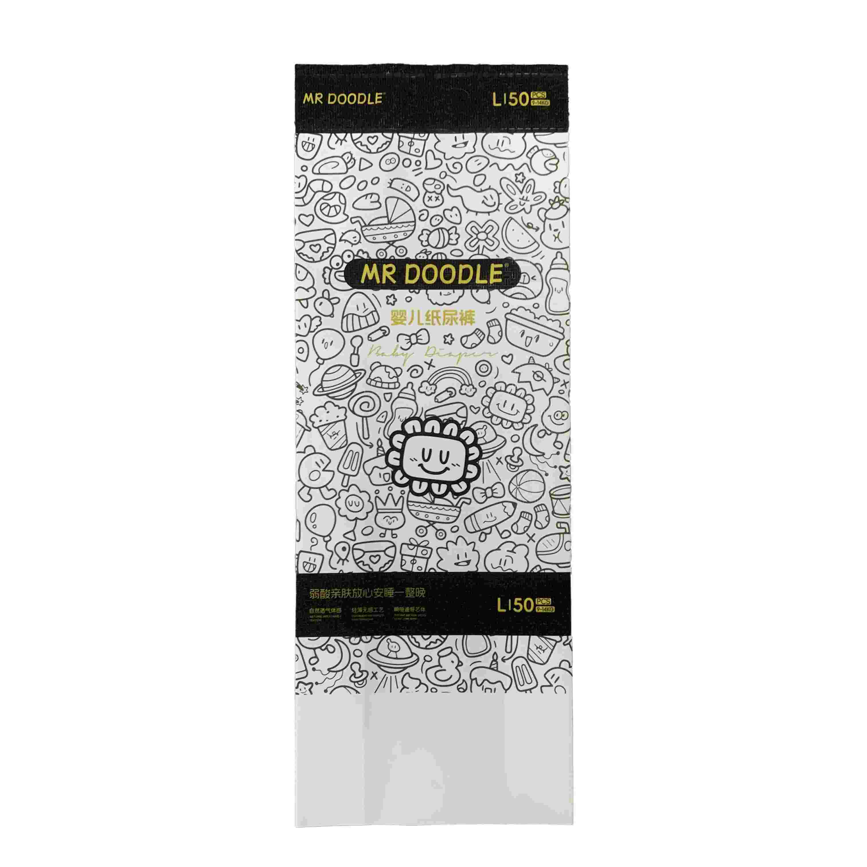
When we got the brief to design packaging for MR DOODLE baby diapers, the first step was to immerse ourselves in the brand. MR DOODLE is known for its playful, doodle - filled art style, so the packaging needed to mirror that whimsical, creative vibe. The client emphasized showcasing the “L150” size, “baby diaper” function, and integrating the signature doodle aesthetic. They wanted packaging that would stand out on shelves, appeal to parents who love unique, artistic designs, and still communicate the product’s reliability for baby care.
We started by researching the baby diaper market. Trends showed that while functionality (leak - proof, softness) is key, modern parents also seek packaging that reflects personal style. Competitors often use pastel colors or cute animal motifs – but MR DOODLE’s art is bold and chaotic in the best way. Our audience? Parents who appreciate artistry, want products that feel special, and need to trust the diaper’s performance. So, we needed to balance MR DOODLE’s artistic DNA with clear product info (size, quantity) and a sense of reliability.
Our team leaned into MR DOODLE’s signature style: maximalist, hand - drawn doodles. We decided to cover the package in a seamless pattern of the brand’s iconic characters and objects – creating a “doodle explosion” that feels fun and unique. For colors, we went with black - and - white to let the doodles pop (and hint at the brand’s edgy, artistic roots). We reserved color accents (like gold for text) to highlight key info without clashing.
We chose a stand - up pouch with a resealable top (自立自封袋). Why? It’s practical for storing diapers, keeps them clean after opening, and stands out on shelves. The vertical shape also lets the doodle pattern flow continuously, enhancing the artistic impact. We added a small transparent window? No – the doodles are so compelling, we wanted the whole package to be a canvas. Instead, we focused on clear labeling for size (“L150”) and product type (“baby diaper”).
We picked a durable, matte - finish plastic composite (耐用哑光塑料复合材料). It needed to:
-
Withstand handling (no scuffing the doodles!).
-
Have a premium feel (matte finish avoids cheap shine).
-
Be resealable (to keep diapers fresh).
This material let us print the intricate doodle pattern with sharp lines and high contrast, making the black - and - white design pop.
The MR DOODLE logo sits front and center, bold and black, to anchor the design. Below it, “baby diaper” is written in a playful font that echoes the doodle style. Key info like “L150” and product benefits (“soft, leak - proof”) are placed in black bands – these break up the doodle chaos slightly and make vital info easy to find. We used gold text for “MR DOODLE” and product claims to add a touch of luxury, balancing the whimsy with trustworthiness.
We presented the first draft to the client. They loved the doodle immersion but worried the black - and - white might feel too stark for a baby product. So, we added subtle hints of soft gray in the background doodles – just enough to warm it up without losing the boldness. We also adjusted the font size for “L150” to make it more prominent (parents need to spot size quickly!). After 2 - 3 rounds of tweaks, the design felt cohesive: artistic, functional, and on - brand.
Once approved, we prepped files for production. We specified:
-
Material thickness (to ensure the pouch stands upright and resists tearing).
-
Printing techniques (to capture the fine doodle details and crisp black - and - white contrast).
-
Resealable strip mechanics (to guarantee a tight seal for hygiene).
We also provided guidelines for color consistency (those subtle grays had to be perfect!) and quality checks to ensure the doodles printed flawlessly. This attention to detail meant the final packaging would be both a marketing tool (drawing parents in) and a practical storage solution.
In the end, the MR DOODLE baby diaper packaging became a hit. It’s more than a diaper bag – it’s a piece of art that parents proudly display. By merging the brand’s playful soul with smart design choices (structure, material, info hierarchy), we created packaging that sells the product and tells a story. And that’s the magic of good design: turning a diaper package into a conversation starter (and a trust - builder for tiny bottoms!).

![]() Price:
Negotiable
Price:
Negotiable![]() Type:
Negotiable
Type:
Negotiable![]() Package:
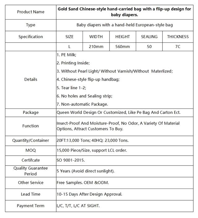
Package: Queen World Design Or Customized, Like Pe Bag AndCarton Ect. Available Pallets
Package:
Package: Queen World Design Or Customized, Like Pe Bag AndCarton Ect. Available Pallets![]() Quality Guarantee Period:
3 years
Quality Guarantee Period:
3 years![]() Function:
Price advantage, anti corrosion and moisture-proof
Function:
Price advantage, anti corrosion and moisture-proof![]() Lead Time:
10-15 Days After Design Approval.
Lead Time:
10-15 Days After Design Approval.![]() Payment Term:
L/C, T/T, L/C AT SIGHT.
Payment Term:
L/C, T/T, L/C AT SIGHT.![]() MOQ:
20,000 PCs per Size
MOQ:
20,000 PCs per Size![]() Quantity/Container:
23,000 Tons per 40HC, 13,000 Tons per 20FT
Quantity/Container:
23,000 Tons per 40HC, 13,000 Tons per 20FT![]() Certification:
Certification:
![]() Other Service:
Free design, Free sample,Many kinds of packaging bag customization
Other Service:
Free design, Free sample,Many kinds of packaging bag customization