Hot Keyword:
![]() Price:
Negotiable
Price:
Negotiable
![]() Type:
Negotiable
Type:
Negotiable
![]() Package:
Package: Queen World Design Or Customized, Like Pe Bag AndCarton Ect. Available Pallets
Package:
Package: Queen World Design Or Customized, Like Pe Bag AndCarton Ect. Available Pallets
![]() Quality Guarantee Period:
3 years
Quality Guarantee Period:
3 years
![]() Function:
Price advantage, anti corrosion and moisture-proof
Function:
Price advantage, anti corrosion and moisture-proof
![]() Lead Time:
10-15 Days After Design Approval.
Lead Time:
10-15 Days After Design Approval.
![]() Payment Term:
L/C, T/T, L/C AT SIGHT.
Payment Term:
L/C, T/T, L/C AT SIGHT.
![]() MOQ:
20,000 PCs per Size
MOQ:
20,000 PCs per Size
![]() Quantity/Container:
23,000 Tons per 40HC, 13,000 Tons per 20FT
Quantity/Container:
23,000 Tons per 40HC, 13,000 Tons per 20FT
![]() Certification:
Certification:
![]() Other Service:
Free design, Free sample,Many kinds of packaging bag customization
Other Service:
Free design, Free sample,Many kinds of packaging bag customization
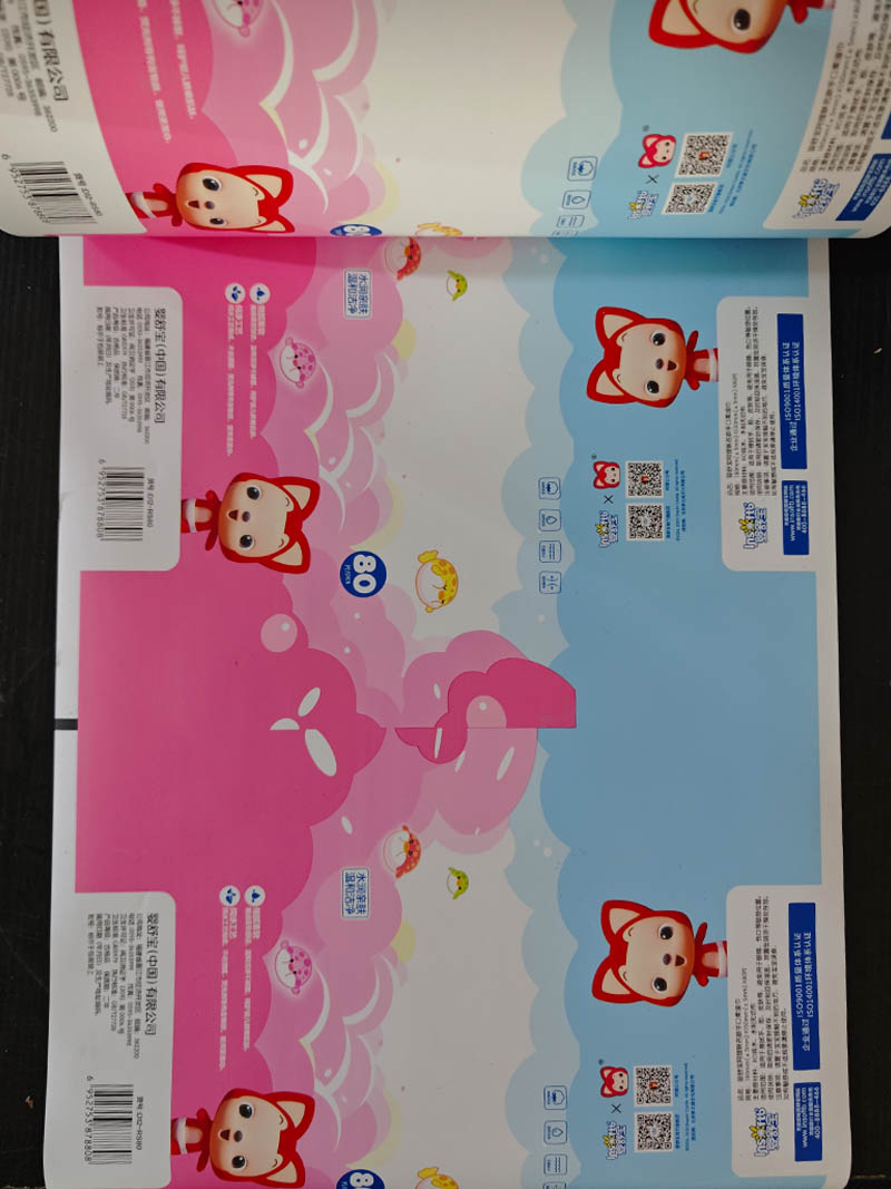
After completing the initial design, we conducted a series of validations. First, we simulated the in - store display effect, adjusting the color saturation and graphic layout according to the feedback to ensure the packaging can attract consumers in the actual market environment. Then, we invited representatives of the target consumer groups to provide opinions on the packaging's “cuteness”, “information clarity”, etc. Based on the feedback, we further optimized the design, such as adjusting the position of the cartoon character and the arrangement of information. Finally, after several rounds of modifications and verifications, we determined the final packaging design, helping the client's products enter the market with an attractive and professional image, and effectively conveying the brand's cute and friendly concept.

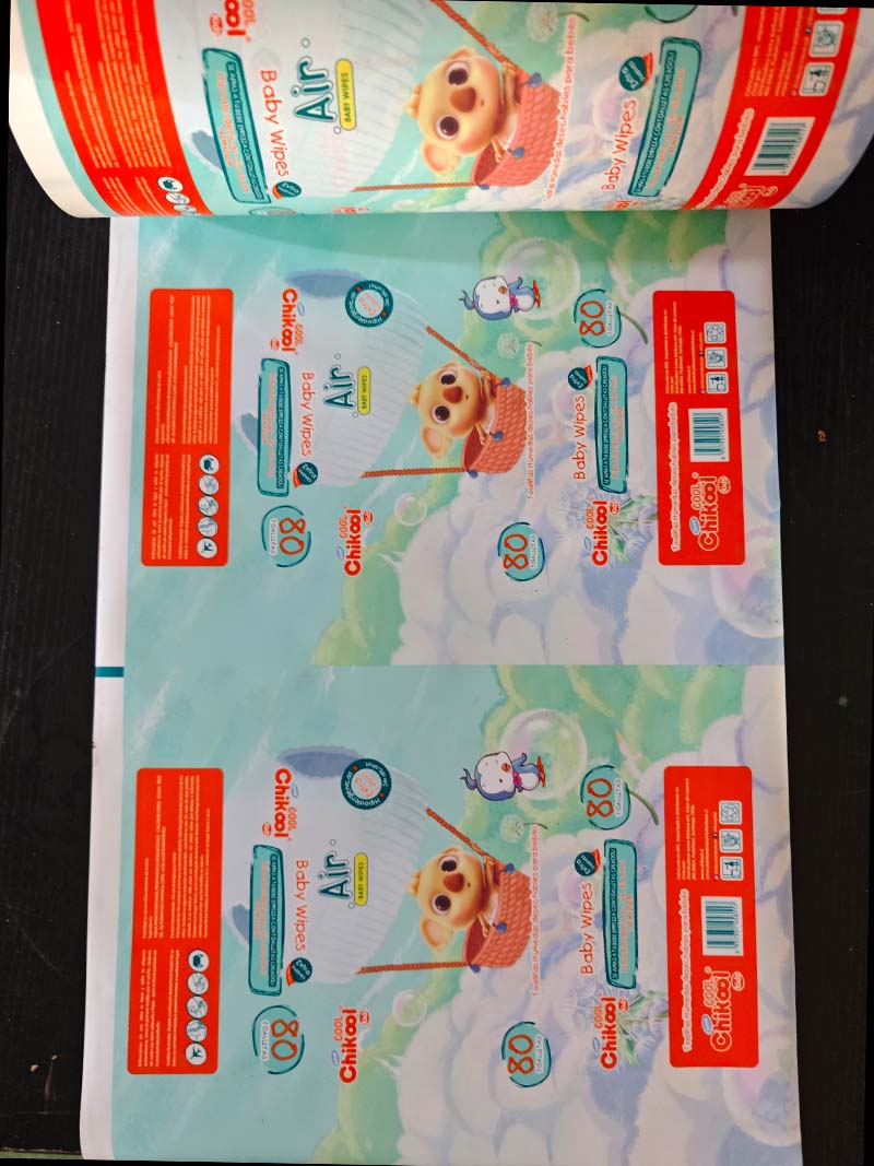
Packaging Design Process for Chikool Air Baby Wipes 1. Demand Understanding: Focusing on Baby Care Attributes When we received the packaging design task for Chikool Air Baby Wipes, we first conduct...
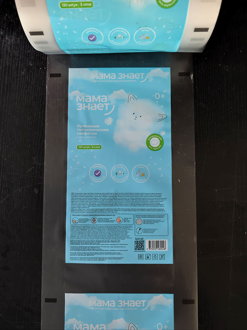
Packaging Design for “Mama Знает” Baby Wipes: Guarding with Purity, Conveying Maternal - Infant Care I. Requirement Insight: Accurately Capturing Pain Points in the Maternal - Infant Market Up...
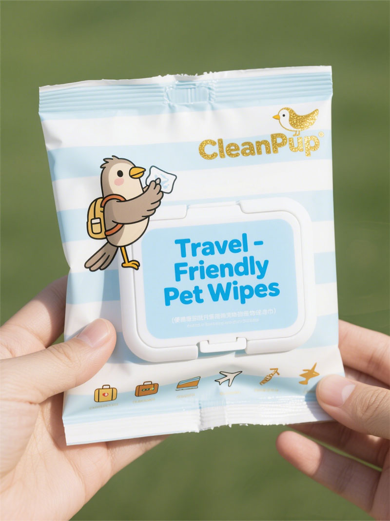
The Complete Packaging Design Process for Malaysia's CleanPup Pet Wipes When the Malaysian pet wipe brand CleanPup sought packaging design collaboration, we embarked on a creative exploration centered...
 Tel: +86-18359551931
 Email: nicole@tansoxpack.com
 MP/WhatsApp: +86-18359551931
 Manufacturer Address:No.179,Tangsu Industrial Park,Tangshi Community,Xintang Street,Quanzhou City,Fujian Province CHINA